Because it may be helpful for your financial wellness
The social structure seems to be moving from pyramidal to an hourglass aspect, where the rich are getting richer and the poor just a little less poor. In a globalized world, keeping an eye on the Gini Index offers food for thought that can be useful for setting up your financial wellness.
For example:
a – during your working life – how to guide the choice of the country where your skills have a potentially optimal context to be exploited.
b – during retirement – how to guide the choice of the country where your annuity has overall more significant value.
Probably for point a – countries with low Gini Index agree, while for point b – those with high Gini Index agree. Of course, the answer is more complex, but the Gini Index is still a helpful guidance tool.
What is the Gini Index
The Gini coefficient or index, introduced by the Italian statistician Corrado Gini, is one of the most popular tools for calculating income inequality and the unequal distribution of wealth within a social system.
In practice, this is a number ranging from 0 to 1. Zero indicates a situation in which all citizens have the same income. In contrast, the value 1 corresponds to the case where a single person receives all the country’s income while others have zero income. In other words, the lower the value, the more equal the distribution.
Sometimes the Gini index is multiplied by one hundred, thus becoming a value between 0 and 100, easier to view and understand its growth or decrease trends graphically.
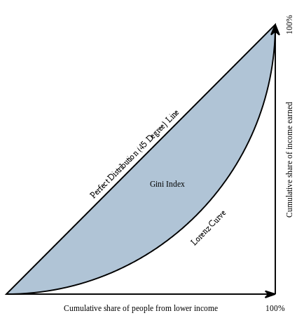
To understand how the Gini coefficient is calculated, we must first talk about the Lorenz curve, a graph that Max O. Lorenz defined in 1905 to visualize income distribution. Building the chart is, at least in theory, straightforward.
The Lorenz curve
Economists use the Lorenz curve to assess the degree of inequality in the distribution of income.
The percentage of earned income is placed on the ordinate axis, and the percentage of the population receiving income is placed on the abscissa axis.
Applications of the Gini Index
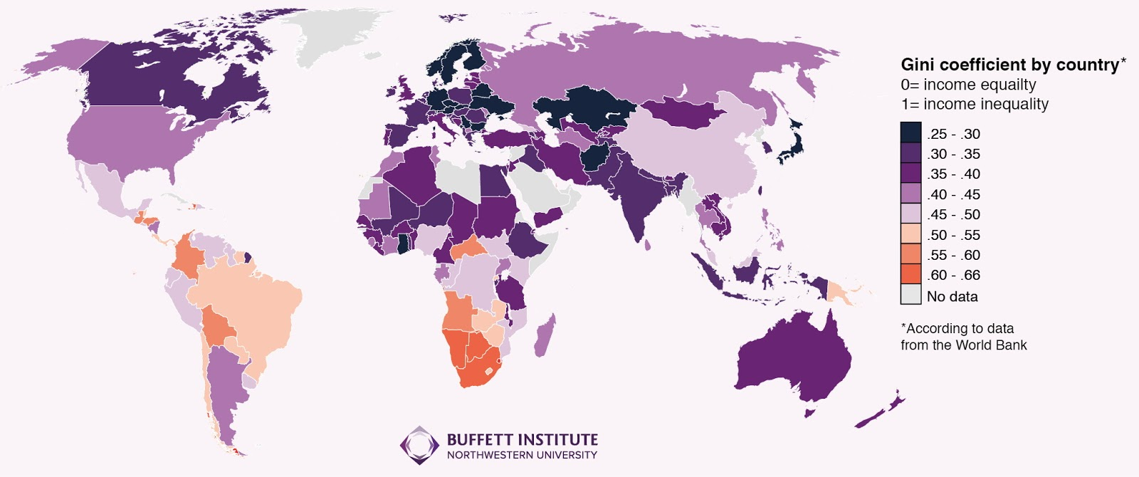
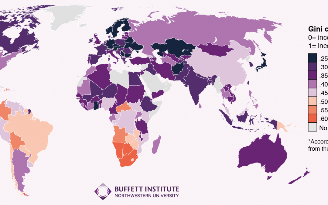
In 2016, scholars from the Buffett Institute for Global Studies drew up a world map based on the Gini index, highlighting economic inequality country by country.
The latter shows that in Europe, the countries with the minor inequalities are the Scandinavian countries, Germany, and some Eastern European countries (Slovenia, Slovakia, Czech Republic), with a Gini index between 0.25 and 0.30. By contrast, the countries with the highest wealth concentration index are Bolivia and Colombia in South America, Namibia, Gambia, and South Africa in Africa, with values close to 0.66.